ZAN projects

Boxes
Annotation
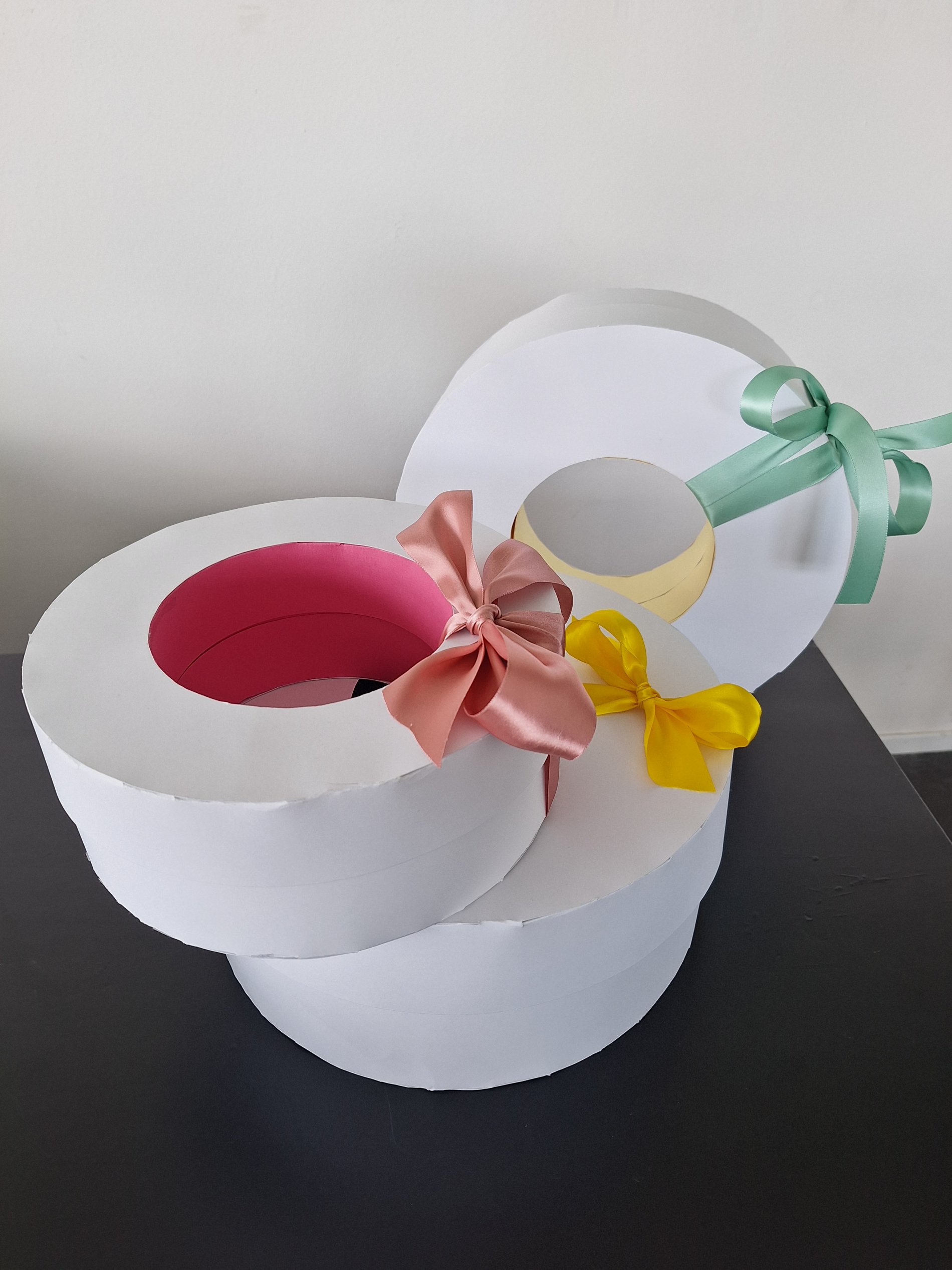
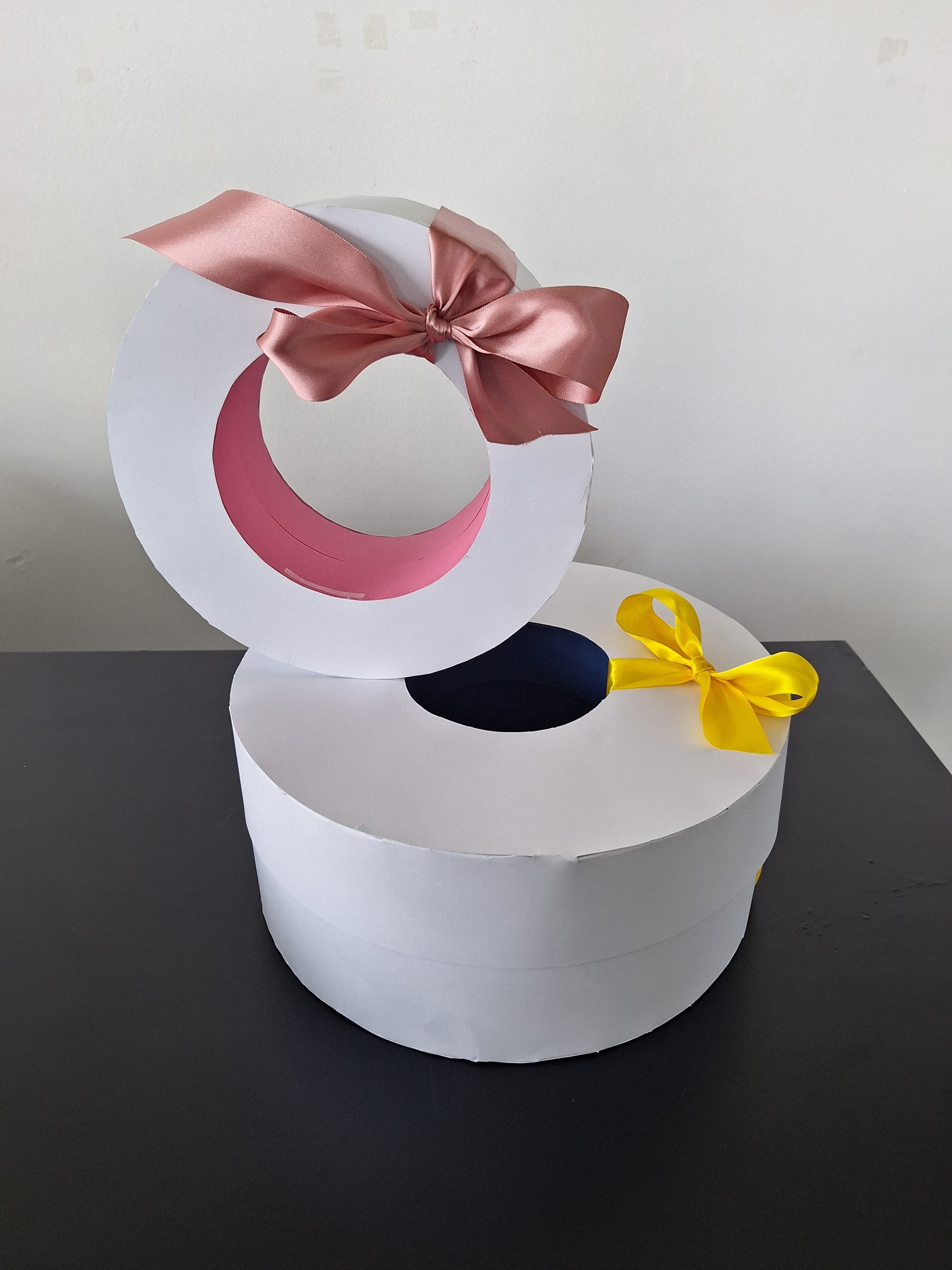
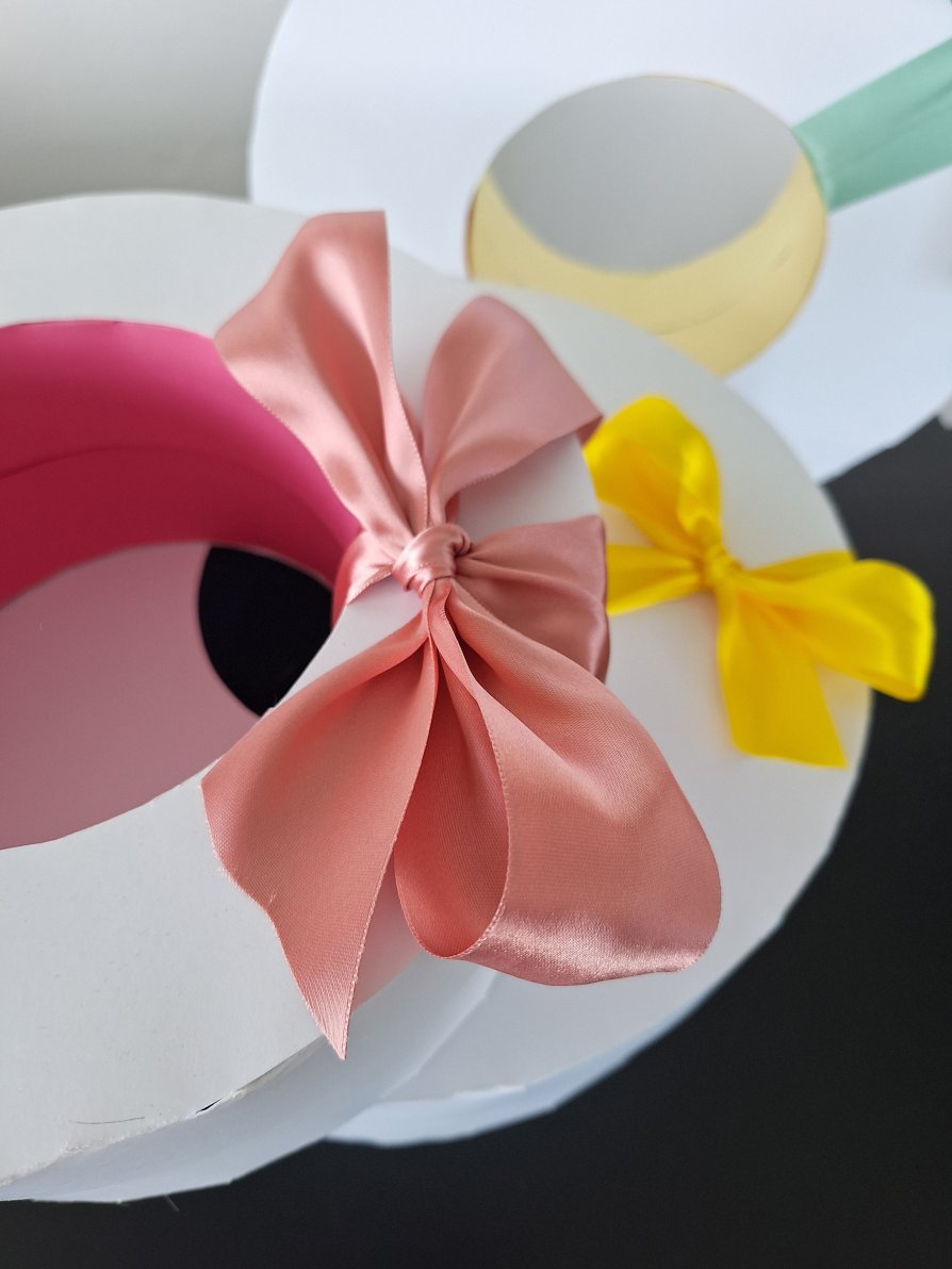
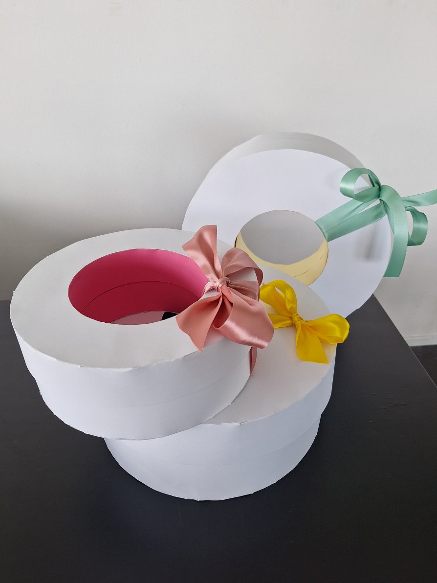
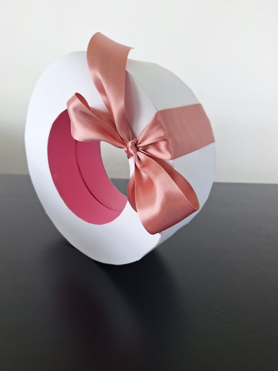
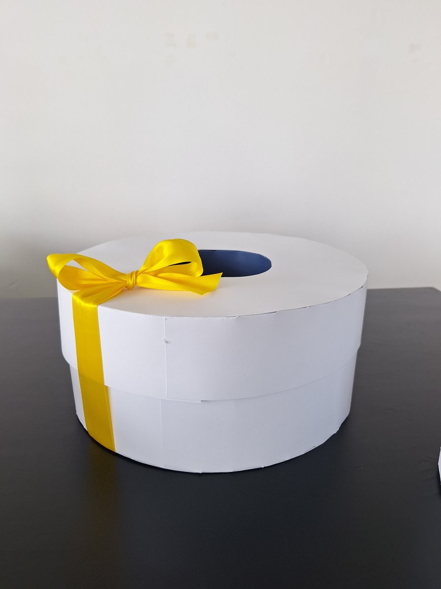
Every wreath deserves beautiful packaging. That's why I chose a round shape for the box that matches the wreaths. The boxes are not only elegant to look at, but also practical for safe storage and transportation (thanks to stackability). I match the colors of the inner circle to the flavors of the wreaths so that the whole looks harmonious and balanced. Just tie a bow and the resulting product resembles a luxurious gift (which was the purpose). For the logo that represents the client's company, I chose to place it on the inside of the circular cutout. It is visible from almost every side, which is very important and does not disrupt the design of the box. Thanks to the specific shape and overall appearance, the product will be unique and easy to remember.